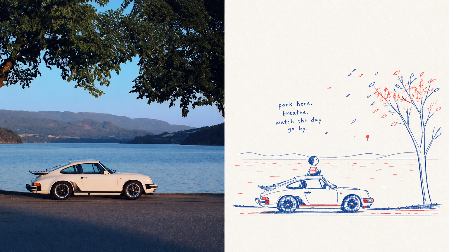
Xiaoxiaodong x Childlike P067
Created by Xiaoxiaodong
Xiaoxiaodong x Childlike P067
Created by Xiaoxiaodong
Showcase
Description
The P067 prompt set nails the lively spirit of a sketch on scrap paper: ⚬ Pure red-and-blue ink: The entire image abandons all other colors, using only a vintage blue and tomato red with the texture of ballpoint pen or crayon. The lines are fine, with slight signs of hand tremors and repeated drawing. The two colors are not evenly distributed, appearing naturally only along key outlines and in small local color blocks. ⚬ A single visual focal point: Never copy the original background. Extract only the core action and expression, allowing for a touch of innocent exaggeration in the proportions. The result should immediately evoke the original image while adding plenty of humor. ⚬ A clean, near-white paper background: Broad areas of pure white space, with no dirty or yellowed filter. Only a very subtle paper-fiber texture remains, making the image feel airy and freshly drawn. ⚬ A handwritten short phrase with baseline shifts: The text is no longer a rigid poster headline, but a spontaneous childlike remark, sound effect, or conversational phrase. Uneven strokes hover in the empty space, naturally echoing red-and-blue arrows or small symbols. The upper half presents serious real-world light and shadow; the lower half becomes a private observation journal full of breathing room.
Recommended by
淡苍
Why we love this skill
Uses the original creative brief as the sole artistic authority, preserving the childlike hand-drawn language while turning photos into finished top/bottom, left/right, pure-design, and multi-device wallpaper outputs. Each creation is strictly isolated for accurate, controllable layouts, text, and specifications.
Related Skills
View all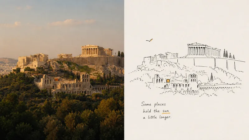 Image
ImageXiaoxiaodong · Line · p062
p062 is for: illustrators / independent publication layout enthusiasts / people who love a spontaneous “sketchbook diary” style of recording Core pain point: AI-generated “line art” always has a boringly precise quality—the lines are too straight and too smooth, like vector graphics traced in CAD, with none of the breath and spirit of drawing by hand on paper. I’ve always felt that the best drawings aren’t necessarily the most accurate. They’re the ones with a relaxed quality, as if you casually sketched a couple of lines and stopped. The most ingenious part of these prompts is that they push AI to learn **“smart clumsiness”**: Run an image through them, and the resulting lines aren’t stiff digital outlines. They look as if you pulled a pocket fountain pen from your bag and casually drew on a napkin or in a sketchbook—every slight hand tremor, loose connection, and even the trace of a mistaken line being corrected remains visible. ⚬ Top half: preserve the original image and apply a layer of transparent, independent-publication photography color grading. ⚬ Bottom half: discard the complexity of the scene and use only ultra-minimal black hand-drawn lines to capture the key person or action. ⚬ Almost no color is used across the image: select the most noticeable color from the original photo—such as a corner of someone’s clothing or a roadside flower—and place it in a tiny area, like a flashback. Everything else is made up of large areas of clean, pale background and negative space. ⚬ One or two slightly quirky, humorous handwritten notes sit beside the image, following the composition. They feel both like snippets from a personal diary and like an interior illustration from an independent art magazine. From a distance, the layout looks highly refined; up close, it’s full of gentle, lively handmade marks.
 Image
ImageXiaoxiaodong x Duotone P065
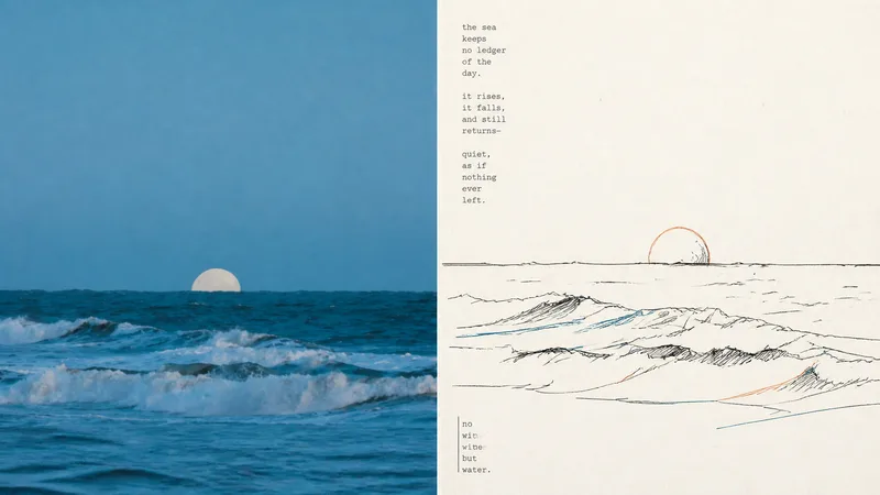
P065 addresses a core problem: AI-generated color illustrations often overfill the image with colors, making them look muddy and like flashy children's doodles. They struggle to capture the restraint and sophistication of niche independent print works made with “just two overprinted colors and slight misregistration.” If you like the duotone printed matter found in independent bookstores—using just one or two touches of color with a subtle misaligned quality—this set of prompts was tuned for you. Rather than using large areas of flat color, it deconstructs your photo with highly avant-garde **“duotone line overprinting”**: ⚬ Black lines form the framework: slightly awkward, hand-drawn pen lines with wobbles and pauses pick out the subject, even allowing lines to cross boundaries or remain partly open, leaving rigid vector outlines behind. ⚬ Exactly 2 extracted colors: AI selects two high-contrast colors from your original image—one cool and one warm, or one dark and one light—and turns them into colored contour lines. They run alongside, overlap, or sit slightly out of register with the black lines, much like the small errors left by an antique printing press during overprinting. ⚬ Light-colored paper and generous whitespace: No complex backgrounds. The subject may be off-center, reduced in scale, or left floating, allowing rough paper texture and broad areas of blank space to carry the image’s sense of air. ⚬ Letterpress typography with handmade irregularities: Pair it with narrow vintage letterpress text, slightly loose tracking, and a subtly wavering baseline, like a carefully typeset private art poster. Smart and restrained, with just a hint of dry humor and relaxed ease.
 Image
Imagexiaoxiaodong P116 | Doodle
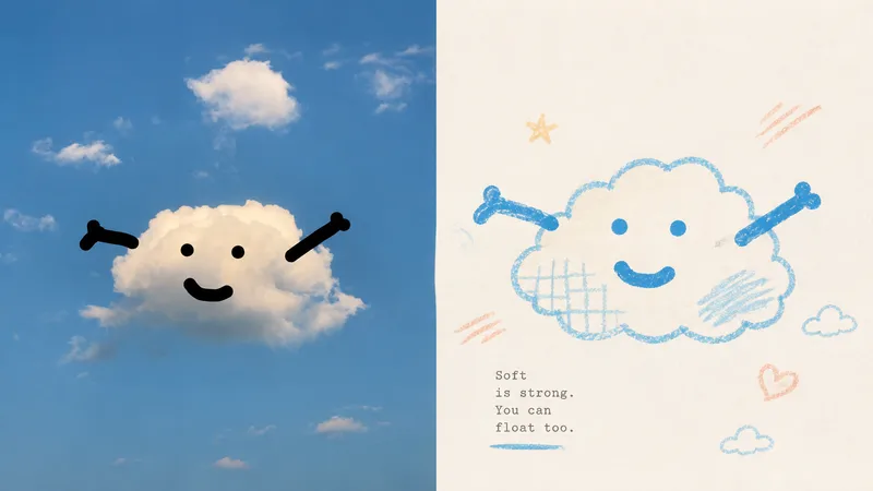
Some photos are truly moving not because of how much information they contain, but because of a single subject, a particular pose, a few colors, and the emotion captured in the image. Panel 116 keeps the real photo in the upper half, then translates the lower half into pastel crayon doodles on an extremely light paper surface: coarse-grain outlines, a few soft color blocks, minimal symbols, and small-scale subjects that leave room to breathe. Ideal for these situations You want to preserve the photo’s identity and natural texture while creating a lighter poster that feels more like an art publication. You don’t want to trace every object, create a realistic redraw, or fill the background with details. You only want to retain the core subject, relationships, and visual memories. You like bright, soothing pastel colors but don’t want anything gloomy, low-contrast, fluorescent, or cheaply candy-colored. You need the same style to produce consistent results across top-and-bottom layouts, left-and-right layouts, pure designs, multiple aspect ratios, four-end wallpapers, or catalog batch processing. What it solves for you It removes secondary information from complex photos so the subject isn’t overwhelmed by details and decoration. It uses clear colored lines and a light paper background to maintain recognizability and keep the subject from blending into the background. It ensures the split composition contains exactly two 50:50 regions, with no title strip, bottom bar, or third section. Each image is generated directly from the current original in a single pass, without sending samples, intermediate results, or work from other Panels back into the model.
Information
- Version
- v4
- Last updated
- Runtime credits
- Usage-based
- Models
- Auto
