Xiaoxiaodong · Line · p062
By Xiaoxiaodong
Xiaoxiaodong · Line · p062
By Xiaoxiaodong
Showcase
Description
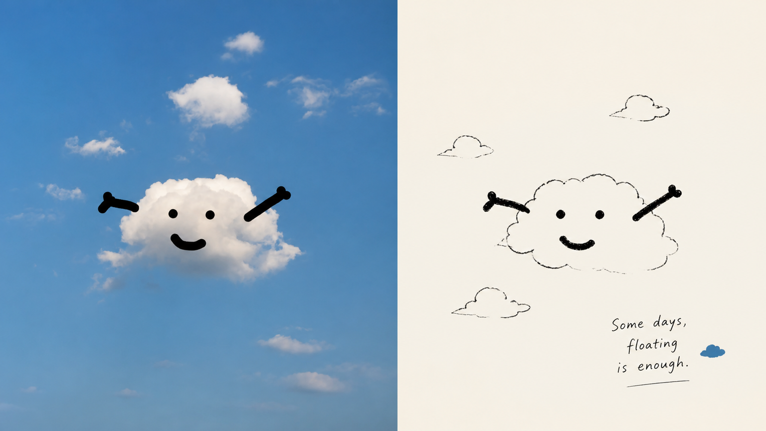
p062 is for: illustrators / independent publication layout enthusiasts / people who love a spontaneous “sketchbook diary” style of recording Core pain point: AI-generated “line art” always has a boringly precise quality—the lines are too straight and too smooth, like vector graphics traced in CAD, with none of the breath and spirit of drawing by hand on paper. I’ve always felt that the best drawings aren’t necessarily the most accurate. They’re the ones with a relaxed quality, as if you casually sketched a couple of lines and stopped. The most ingenious part of these prompts is that they push AI to learn **“smart clumsiness”**: Run an image through them, and the resulting lines aren’t stiff digital outlines. They look as if you pulled a pocket fountain pen from your bag and casually drew on a napkin or in a sketchbook—every slight hand tremor, loose connection, and even the trace of a mistaken line being corrected remains visible. ⚬ Top half: preserve the original image and apply a layer of transparent, independent-publication photography color grading. ⚬ Bottom half: discard the complexity of the scene and use only ultra-minimal black hand-drawn lines to capture the key person or action. ⚬ Almost no color is used across the image: select the most noticeable color from the original photo—such as a corner of someone’s clothing or a roadside flower—and place it in a tiny area, like a flashback. Everything else is made up of large areas of clean, pale background and negative space. ⚬ One or two slightly quirky, humorous handwritten notes sit beside the image, following the composition. They feel both like snippets from a personal diary and like an interior illustration from an independent art magazine. From a distance, the layout looks highly refined; up close, it’s full of gentle, lively handmade marks.
Recommended by
淡苍
Why we love this skill
Uses the original creative brief as the sole aesthetic guide, preserving the distinctive character of the lines, negative space, and materials. Supports top/bottom, left/right, pure-design, and multi-device wallpaper layouts, with image-by-image output checks.
Related Skills
View all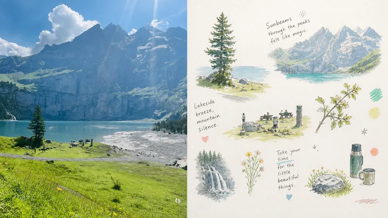 Image
Imagexiaoxiaodong × Life Notes P089
P089 has been experimenting with an AI image style I really love lately. It doesn't simply turn a photo into a full-page scene. Instead: The top half keeps the original photo, while the bottom half automatically generates a set of “floating lifestyle vignette journal” elements. I tried it with many completely different images: 🥐 Comforting brunches 🌸 Wildflowers by the roadside 🎒 Everyday carry items 🐱 Sleeping kittens 🛋️ Warm rooms It makes the feeling of everyday life instantly expand. The most interesting part is that the AI doesn't rigidly recreate one large scene. Instead, it breaks the photo into separate vignettes floating as scattered points: a central subject paired with surrounding close-ups of food, plants, objects, and clothing patterns. Loose, childlike fine lines, watercolor, and colored pencil add gentle touches, interspersed with handwritten reflections on everyday life and doodle-like symbols. The entire page feels relaxed, tender, and softly alive.
 Image
ImageXiaoxiaodong x Crayon x Sketch x P075
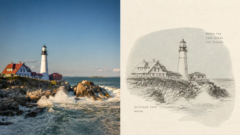
Panel 075 preserves the subject’s most essential proportions, direction, structure, and pose, then redraws them with loose, dark crayon lines that retain subtle signs of correction. A low-saturation, irregular color field drawn from the original image’s overall tones provides quiet support, while cream handmade paper and generous negative space carry the mood, distance, and passage of time. A few tiny typewritten words feel like private notes without interrupting the image’s breathing room. Best suited for Tired of formulaic vintage filters: The paper, grain, and imperfect lines all take part in the storytelling rather than applying a uniform effect over the photo. Need to draw less while staying accurate: Details can remain unfinished, but the subject’s key proportions, direction, structure, and pose must remain recognizable. Drawn to a quiet independent-publishing aesthetic: A soft monochrome color field, Risograph grain, generous negative space, and small typewritten text create a restrained layout. Need flexible delivery: Supports portrait, landscape, design-only, multiple aspect ratios, and four-sided wallpapers, and can also process image directories in batches.
 Image
Imagexiaoxiaodong × Naive P098
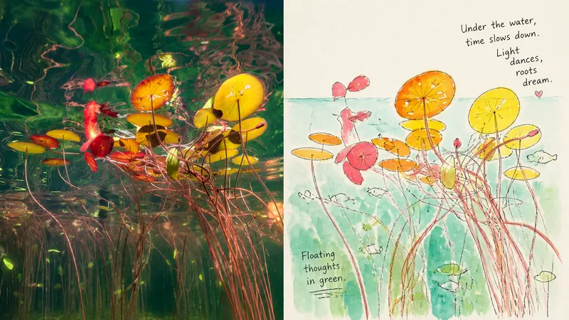
A photo’s meaning doesn’t have to be preserved through complete depiction. Panel 098 simplifies people, animals, buildings, and everyday moments into visual symbols that remain instantly recognizable, then tells them as a small world through loose ink lines, flat watercolor, visible brushstrokes, and childlike handwritten lettering. It may look innocent, but it is supported by sophisticated use of negative space, shifts in scale, and narrative pacing. Good for these situations When you want a lighter photo story: Preserve identity and key poses while intentionally leaving out irrelevant backgrounds and trivial details. When you like an authentic handmade feel: Lines crossing boundaries, watermarks, exposed paper, exploratory lines, and partially open contours all serve as intentional visual language. When you need bright but not cheap-looking colors: Select the liveliest colors from the original image and remix them, leaving pale paper tones for visual breathing room. When you need flexible delivery: Supports vertical, horizontal, pure design, multiple aspect ratios, and four-edge wallpaper, and can also process image directories in batches.
Information
- Version
- v4
- Last updated
- Runtime credits
- Usage-based
- Models
- Auto
