Xiaoxiaodong x Duotone P065
By Xiaoxiaodong
Xiaoxiaodong x Duotone P065
By Xiaoxiaodong
Showcase
Description
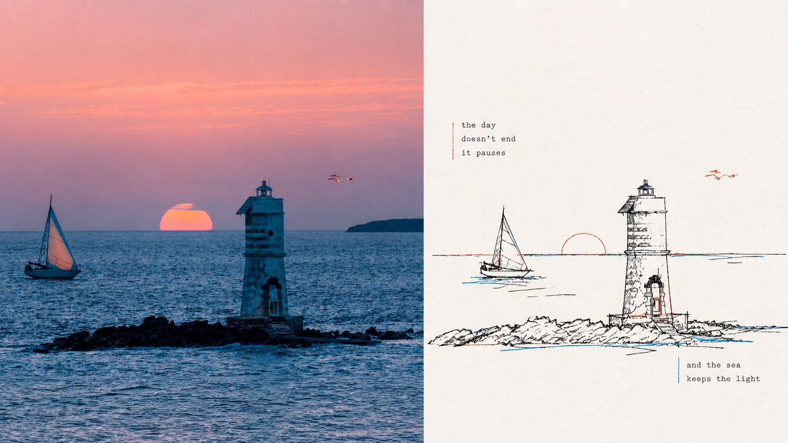
P065 addresses a core problem: AI-generated color illustrations often overfill the image with colors, making them look muddy and like flashy children's doodles. They struggle to capture the restraint and sophistication of niche independent print works made with “just two overprinted colors and slight misregistration.” If you like the duotone printed matter found in independent bookstores—using just one or two touches of color with a subtle misaligned quality—this set of prompts was tuned for you. Rather than using large areas of flat color, it deconstructs your photo with highly avant-garde **“duotone line overprinting”**: ⚬ Black lines form the framework: slightly awkward, hand-drawn pen lines with wobbles and pauses pick out the subject, even allowing lines to cross boundaries or remain partly open, leaving rigid vector outlines behind. ⚬ Exactly 2 extracted colors: AI selects two high-contrast colors from your original image—one cool and one warm, or one dark and one light—and turns them into colored contour lines. They run alongside, overlap, or sit slightly out of register with the black lines, much like the small errors left by an antique printing press during overprinting. ⚬ Light-colored paper and generous whitespace: No complex backgrounds. The subject may be off-center, reduced in scale, or left floating, allowing rough paper texture and broad areas of blank space to carry the image’s sense of air. ⚬ Letterpress typography with handmade irregularities: Pair it with narrow vintage letterpress text, slightly loose tracking, and a subtly wavering baseline, like a carefully typeset private art poster. Smart and restrained, with just a hint of dry humor and relaxed ease.
Recommended by
淡苍
Why we love this skill
Featured for its original design brief, controlled aesthetic boundaries, multi-format outputs, batch processing, precise text, and exact size delivery.
Related Skills
View all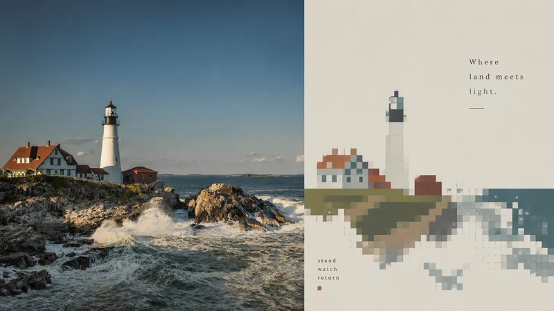 Image
ImageXiaoxiaodong x Pixels x Color Blocks P063
P063 addresses a core problem: when AI creates “pixel art,” it often defaults to an 8-bit retro game interface or Minecraft, filling the image with flashy noise and none of the sophisticated layout found in modern graphic design. If you want to turn a photo into pixel art but strongly dislike that dated Famicom-style retro game look, try this new approach: Use pixels as a “color-block mask” for layout. Instead of pixelating the entire image, it extracts a large silhouette from your photo as a visual container, then embeds the key subject, movement, or local details inside it using highly restrained stepped pixel blocks and color fields.
 Image
Imagexiaoxiaodong × Comms × Type × P096
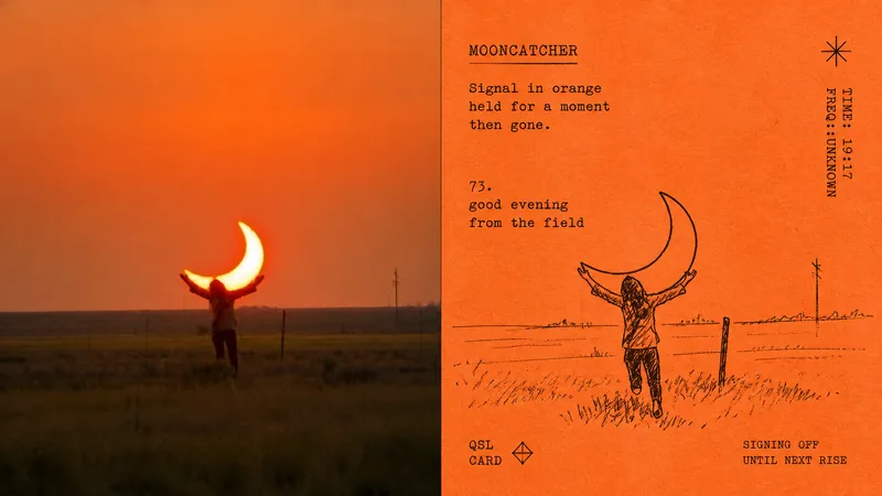
Panel 096 uses delicate pen-and-ink linework to preserve the subject’s identity, with broken contours and sparse hatching / cross-hatching to capture key actions. Text enters the layout in a narrow, worn, misaligned vintage typewriter font, as if typed directly onto a card by a private enthusiast. Best suited for Want a folk-print texture: Monochrome reproduction ink on a vivid sheet of colored paper, preserving paper fibers, copy grain, and registration shifts. Need a privately made-looking layout: Freely mix the subject and text, with partial cropping, misaligned alignment, and irregular blank space along the edges. Prefer a restrained but distinctive result: Use just one sheet of colored paper and one ink color, without rich palettes or commercial retro templates. Need flexible delivery: Supports vertical, horizontal, design-only, multiple aspect ratios, and four-edge wallpapers, and can also process image directories in batches.
 Image
Imagexiaoxiaodong P097: Retro Print
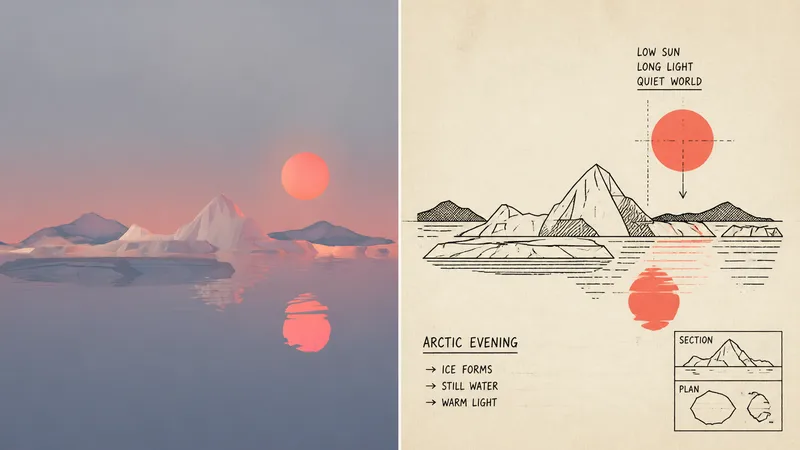
Panel 097 uses economical linework, flat schematic perspective, and a few geometric shapes to preserve the subject’s identity; deep black handles outlines and information layers, while a second spot color is extracted from the photo to create restrained two-color spot printing. Hand-drawn commercial lettering, guide lines, and a touch of awkward functional humor make “explaining this” itself part of the image. Suitable for these situations Need an instantly recognizable diagram: Use outlines, boxes, holes, panels, and directional relationships to clarify the subject and story. Like the strength of vintage printing: Pair deep black with a second spot color extracted from the original image, plus a warm off-white paper surface and subtle misregistration grain. Want understated humor: Vintage commercial hand lettering and a few supporting symbols serve the narrative without creating decorative noise. Need flexible delivery: Supports top-to-bottom, left-to-right, pure design, multiple aspect ratios, and four-edge wallpapers, while also allowing images to be processed in batches from a directory.
Information
- Version
- v6
- Last updated
- Runtime credits
- Usage-based
- Models
- Auto
