Framed Impasto Miniatures
Bright impasto scenes with tiny figures
Framed Impasto Miniatures
Bright impasto scenes with tiny figures
Showcase
Description
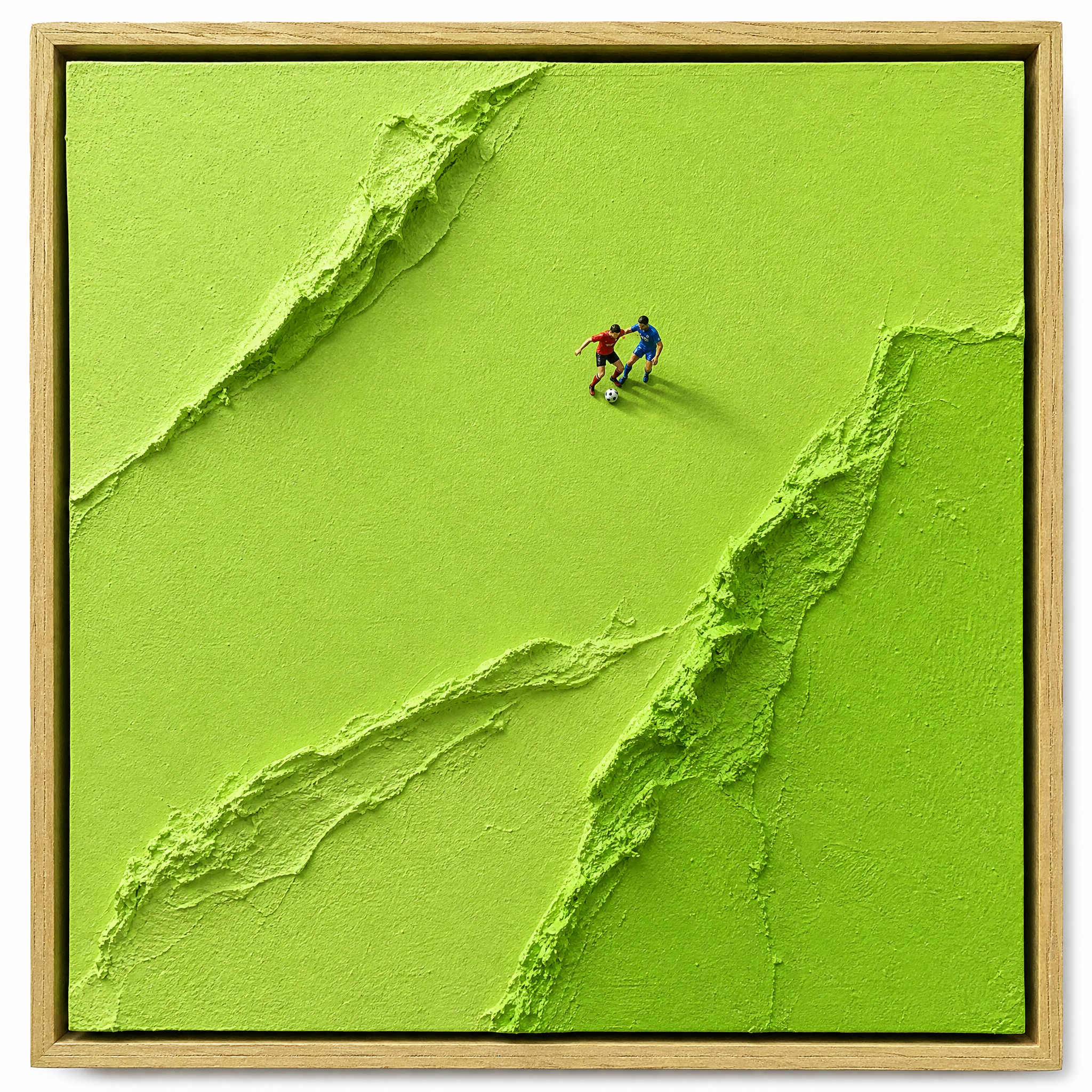
Turn your subject into an impasto paint miniature artwork inspired by Werner Bronkhorst, presented as a framed physical close-up that looks like a real gallery piece. The image defaults to a 1:1 square composition and a straight-down overhead view. A light-colored, fine-grained natural wood frame sits tightly against the edges, filling the canvas with the artwork while avoiding empty space and a loss of scale. The artwork centers on bright, fresh, clean tones such as grass green and matcha green. It is built from a small number of oversized palette-knife color blocks, highlighting the super-matte acrylic modeling paste’s dry, plaster-like hardness. Where the color blocks meet, rough, torn, and curling layers of raised paint create clearly defined relief thickness and a sculptural feel—not a glossy or smoothly brushed surface. You can also specify action themes such as soccer, golf, or running, letting 1 to 3 finely detailed, vivid miniature figures become the focal point. The figures blend into the paint surface with high-contrast solid-color clothing and clear dynamic poses, paired with sharp diagonal cast shadows to enhance realistic proportions, dimensionality, and storytelling. Ideal for contemporary art concept images, miniature scene posters, and decorative visual works.
Recommended by
淡苍
Why we love this skill
Combines light wood framing, a 90° overhead view, bright color blocks, dynamic miniature figures, and sharp shadows for a tactile relief effect with the presence of a real gallery piece.
Related Skills
View all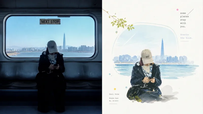 Image
ImageXiaoxiaodong x P070
The P070 skill keeps only the most memorable subject, pose, relationships, and metaphors from a photo, then reorganizes them with hand-drawn outlines, bright impasto, or translucent color blocks. Subjects at a small or medium scale are placed within generous warm-white negative space, while restrained grids, spray dots, glows, and geometric marks provide editorial accents. Fine typewriter-style text is composed alongside the image rather than layered over the finished artwork. Works well when The subject must remain recognizable: The identity of people, buildings, animals, plants, objects, or landscapes should not be replaced by generic color patches. You want vivid without looking cheap: Colors are remixed from the photo’s brightest, most lively tones—without muddy gray filters or piles of candy colors. You need a professional layout: A small-scale subject, bright negative space, directional cues, and restrained small text work together to set the visual rhythm. You need flexible deliverables: Supports top/bottom, left/right, design-only, multiple aspect ratios, and four-edge wallpapers, as well as batch processing for image directories.
 Image
ImageGPT2 x Impasto x Emergence
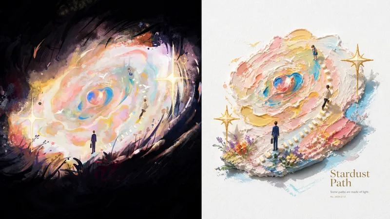
046 recently refined a poster prompt set centered on “3D impasto oil painting x vivid miniature landscapes.” The generated images have a bright, soothing artistic quality and tangible physical texture. If you need prompts, feel free to leave a comment! The background is this: many AI oil painting styles can look heavy, dark, or muddy, while 3D rendering often lacks the warmth of hand painting. By combining **sculpture-like miniature forms** with **clear oil paint built up with palette-knife strokes**, and using large areas of pure warm white as a base, this approach creates a fresh aesthetic experience that balances physical substance with a bright, translucent clarity. After repeatedly fine-tuning the lighting and brushwork, I combined “documentary photography” with “vivid impasto miniature landscapes” to develop this poster Skill.
 Image
ImageXiaodong x Paper Collage P077
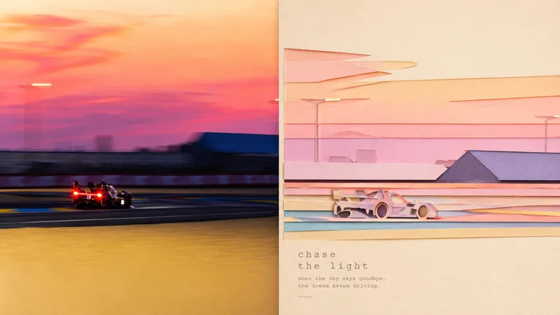
Panel 077 distills the subject, character movement, contour structure, and scene relationships into a paper-cut collage: crisp cut-paper outlines, layered foreground and background shapes, subtle paper grain, cut edges, and soft shadows work together to create a sense of space. The background is deliberately simplified, while pastel colors are remixed from the most vibrant and emotionally resonant parts of the photo. The result feels more like a high-end travel magazine or independent art publication than a collage of cartoon stickers. Great for these situations Want to turn travel photos into paper-art publications: Not by simply shrinking the photo, but by reorganizing the relationship between the subject and the scene. Need a flat design with convincing depth: Cut-paper edges, layered elements, and soft shadows create a tactile feel without heavy plastic-like 3D. Prefer something soft, bright, and refined: Pastel colors are generated from the original image’s vitality and emotional warmth rather than applying a fixed candy-color palette. Need flexible delivery: Supports top-and-bottom, left-and-right, pure design, multiple aspect ratios, and four-edge wallpapers, along with batch processing for image directories.
Information
- Version
- v7
- Last updated
- Runtime credits
- Usage-based
- Models
- Auto
