gb

2.95 万亿美元。
这是波士顿咨询公司(BCG,Boston Consulting Group)2026 年 5 月发布的《全球财富报告》里,香港 2025 年跨境财富管理的账面规模。[¹]
瑞士是 2.94 万亿美元。
差距只有 100 亿——但方向已经翻转。保管全球富人离岸资产最多的地方,不再是阿尔卑斯山脚下那些挂着铜牌的私人银行,而是维多利亚港两岸的写字楼。
两年前,中文互联网给这座城市的标签是“国际金融中心遗址”。
一、“遗址”怎么来的,怎么塌的
2023 年前后,港股低迷,IPO 萎缩,社交媒体上一张维多利亚港夜景叠字图流传甚广——“国际金融中心遗址”。港交所集团行政总裁陈翊庭曾公开表示:香港不只有股市,还有世界顶级的银行、保险与资管。[²]
大部分人没当回事。
然后数据来了。2025 年,港交所 IPO 募资约 350—395 亿美元(按不同统计截止日和口径),时隔六年重返全球第一,领先纽约证交所和纳斯达克。[³] 2026 年势头更凶——截至 8 月初,当年 IPO 募资已超 410 亿美元,超过 2025 全年。[⁴]
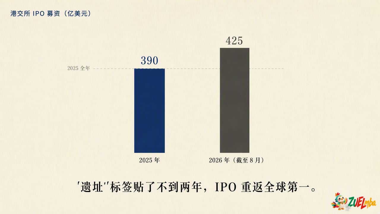
同一时期,香港证监会(SFC)发布的数据显示:2025 年底资产及财富管理业总 AUM 达到 42.2 万亿港元(约 5.4 万亿美元),同比增长 20%,创历史新高。私人银行及私人财富管理 AUM 增长 24%,净基金流入激增 193%,连续第三年正流入。[⁵]
“遗址”标签贴了不到两年,IPO 全球第一,AUM 历史新高,跨境财富管理超越瑞士。
陈翊庭说的那句话被大多数人跳过了。但账本没跳过。
二、2.95 万亿美元到底在说什么
这个数字需要拆。
BCG 定义的“跨境财富管理”(cross-border booking),指的是个人将资产放在自己税务居住国以外的财富中心管理——只算“跨国界的钱”,不算本地人的本地资产。[¹]
2025 年全球前三:香港 2.95 万亿美元,瑞士 2.94 万亿美元,新加坡 2.1 万亿美元。
出版级科研图表制作
Covers publication-ready matplotlib figures for academic papers, slides, and reports—bars, trends, scatter, heatmaps, and multi-panel layouts—with this repository’s house style, print/vector export conventions, and parity with figures4papers demos. Use when the user is finalizing or creating such figures in matplotlib. Do not use for interactive dashboards or web viz (Plotly, Altair, Bokeh), exploratory-only plots without a publication target, dominant 3D or geographic mapping, or Illustrator/Figma-first infographic workflows.
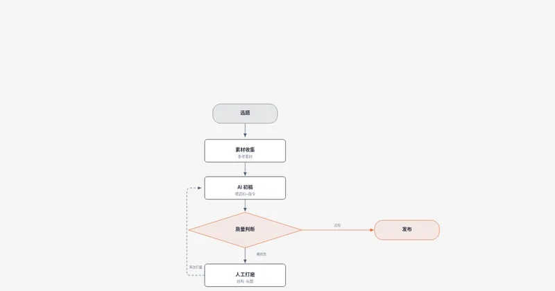
diagram-design
Create branded architecture, IT current-state, flowchart, sequence, state machine, ER/data model, timeline, swimlane, quadrant, radar/spider, polar chart (polar/radial lollipop), loop/flywheel, nested, tree, org chart, layer stack, Venn, pyramid/funnel, treemap, bar, line, Gantt and scatter charts, high-level, process, medallion, data flow, DP integration, DP security matrix, Sankey, fishbone, Wardley map, kanban, user journey, deployment, dependency graph, UML class, story map, or database schema diagrams as standalone HTML/SVG/PNG. Redraw .drawio/.drawio.png/.drawio.svg or Mermaid .mmd sources at a chosen size/detail; onboard brand tokens from a website; add semantic patterns, callouts, accessible motion, or sketchy/hand-drawn styling.
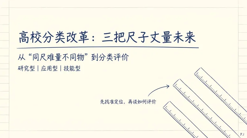
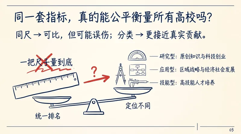
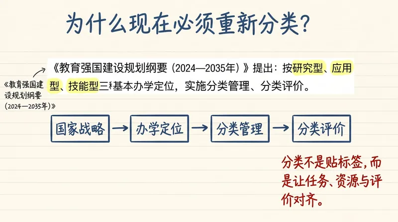
Wang Hong Handwritten PPT
Turn articles, scripts, or technical topics into 16:9 Notability-style handwritten HTML Slides with the academic presentation feel of Wang Hong. Export each page as a PNG, and by default also generate a timeline-based HTML version with animations that can be played item by item. Trigger words: Wang Hong PPT style, Wang Hong handwritten PPT, Notability academic handwritten Slides, handwritten web PPT, handwritten PPT, mathematician handwritten presentation style, handwritten PPT timeline version, handwritten presentation animation.
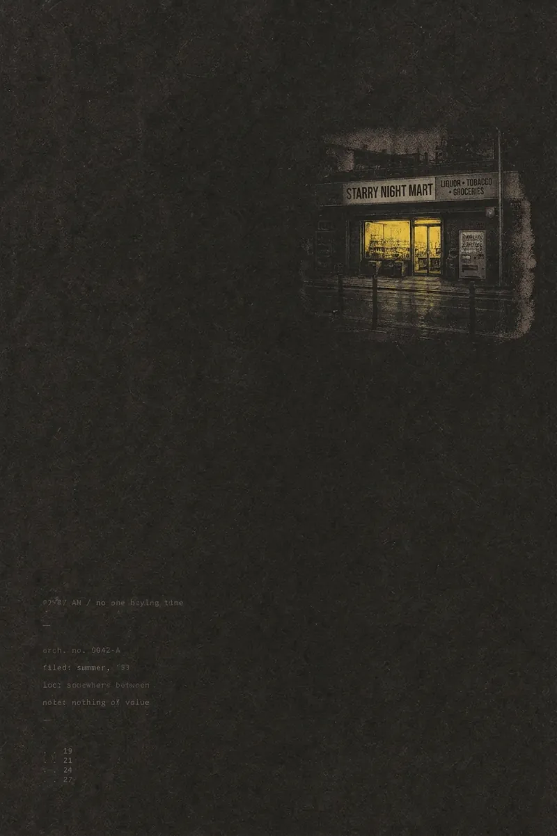
Minimalist Zine-Style Poster
Transform any topic, sentence, object, emotion, article inspiration, photo, or content brief into a quiet minimalist zine-style editorial poster—while also outputting the image and the prompt used to generate it. Vertical 3:5 aged paper canvas, 70-90% whitespace, one high-saturation color anchor, paired with serif/typewriter fonts and scanned paper texture, with a Japanese-Korean independent zine aesthetic.
 Webpage
Document to Accordion Gallery
Automatically decompose product introduction documents into horizontal accordion card galleries, extract colors from brand guidelines to generate AI illustrations, and output a shareable interactive webpage. https://youmind.com/a/jLpgKPahOY1tJF

Generate Social Media Graphics
Convert articles/copy into Xiaohongshu image sets or WeChat Official Account covers. Supports dual visual systems (e-magazine style/Swiss style), intelligently matches layouts and colors, automatically searches for matching images or uses user materials, generating 3-9 professional image cards.
 Webpage
HTML PPT Studio
Generate professional-grade static HTML presentations based on user needs, with 36 themes, 31 layouts, 47 animations, and speaker mode. Supports logo, and the single file runs directly in the browser.
 Image
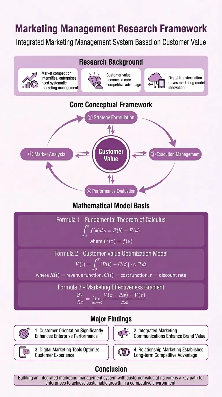
ImageResearch Paper Infographic
Easily transform your scientific research paper content into professional, high-definition academic infographics. Supports 18 mainstream types, making complex research results clear at a glance. Whether showcasing core mechanisms, experimental workflows, or creating graphical abstracts and technical roadmaps, this tool delivers precise results. We understand the rigor required in scientific illustrations, so beyond visual appeal, we prioritize scientific accuracy to ensure every image is clear and free of misleading information. You can directly provide the full paper, key sections, or a research description, and select the most suitable graph type, such as intracellular mechanism diagrams, tumor immune microenvironment diagrams, material catalysis mechanism diagrams, etc. We also offer a variety of color schemes like blue-green, orange, purple, and chart structure styles like left-label and vertical flow, making your infographics both academically compliant and professionally aesthetic. Beyond traditional academic graph types, this tool also supports 15 creative templates for scientific visualization scenarios, helping you turn research concepts into unique visual works such as magazine-quality posters, interface breakdowns, app design boards, etc., suitable for group meetings, social media, or report covers. We provide a strict controllability checklist and a three-step verification process, and support partial modifications to generated images, ensuring every step closely matches your needs, presenting your research results in the most intuitive and accurate way.
 Image
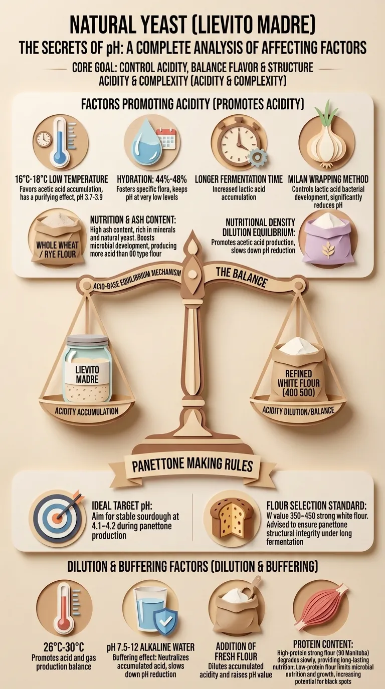
Image3D Paper-Cut Science Diagram
Automatically generate 3D paper-cut style educational science illustrations for articles or topic keywords.
 Image
ImageEconomist-style Chart Generator
Senior information design consultant, skilled at transforming complex text into clear visual charts. Expert in The Economist magazine's visual style: minimalist, data-driven, professional and rigorous.