Relic Art
Minimalist relic art posters, original kept
Showcase
Description
Transform a real photo into a vertical "relic art" poster that blends documentary value with artistic expression: the upper part keeps the original photograph untouched, while the lower part uses warm paper or restrained light and shadow to compress a memory-derived graphic from the image. It's not a typical illustration or decorative poster; instead, it uses sparse ink blocks, softened edges, white-space cuts, and sparse lines to distill architectural, urban, water, road, human-scale, horizon, and light-shadow relationships, so the subject remains recognizable even in thumbnails. The overall feel is quiet, restrained, and like a modern print. Colors are taken from the source photo, primarily deep blue, ink black, gray-green, stone, or low-saturation warm tones, with a small warm accent added when fitting. The title is kept very small, poetic, and similar to an exhibition label, never overwhelming. This is suitable for minimalist art posters, photographic relic series, architectural and urban image posters, abstract editorial photography, gallery-style photo covers, and visual series for mobile platforms like Douyin. The final output preserves the authentic content of the original photo while adding a consistent "memory imprint" below, giving each photo its own mood and an expandable visual identity.
Recommended by
淡苍
Why we love this skill
Featured because it goes beyond photo filters—preserving the original's authenticity while compressing subject, light, and emotion into a minimalist paper relic. The photo and its ink mark form a unique vertical narrative, balancing recognizability, series cohesion, and editorial artistry.
Related Skills
View all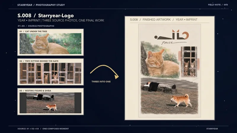 Image
Image【S.008】Imprint
Fuse 2–5 photos into a complete 2:3 vertical visual brand poster, making the photographic content the main visual and extracting a compact, recognizable visual symbol from the photos themselves. Ideal for photographers, visual projects, art exhibitions, and brands that need a distinctive visual identity—for image branding, photography brand posters, and series covers. The work integrates multiple photos through asymmetrical composition, layered cropping, contour relationships, and negative space. It avoids ordinary collages or evenly divided panels, allowing different scenes to form one cohesive visual concept. The poster includes a simple English wordmark and a Brand Symbol related to the photos’ forms, colors, and structure. Together, they act as restrained identity signatures that connect naturally with the imagery rather than appearing as separate stacked logos or titles. The final output is a clean, presentation-ready poster suitable for display and sharing. It preserves the authentic characteristics of the photos while extracting the symbol’s primary colors and visual cues from the source images. Only the necessary English wordmark is retained—no Chinese text, explanatory copy, dates, or unnecessary decoration—making it suitable for creators who want to turn multiple images into a distinctive brand visual.
 Image
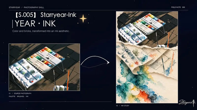
Image【S.005】Photo Ink · Starryear
Transform a single photo into a vertical artwork with tactile quality and narrative depth: the top preserves the source photo as real visual evidence, the middle presents a three-dimensional memory of the photo through lifted, curled, and layered warm ivory handmade paper, and the bottom releases a moist, translucent, diffused afterimage in colored ink. It is suited to creating Starryear ink, torn-paper photo ink, and three-dimensional turning-page ink works with the “original image above, flowing ink released below” structure. It is especially suitable for photos of people, animals, buildings, or landscapes where the original identity, number, direction, and spatial relationships need to remain intact. The finished piece emphasizes one complete vertical composition rather than a simple filter or evenly divided collage. The photo area remains clear and recognizable, while the paper layers carry the rhythm, contours, reflections, or negative space of the scene, using natural paper thickness, deckled fibers, overlaps, and soft shadows to create a convincing page-turning effect. The lower ink section uses a small number of related color families to show water-driven blooming, layered color, backflow, pooling, and seepage, creating a clear spatial transformation as the image moves between materials. The overall design centers on matte warm ivory paper and negative space, avoiding a second complete person, unrelated fantasy elements, decorative paper strips, imitation traditional Chinese painting, or overly saturated visual noise. The final output is a polished vertical artwork.
 Image
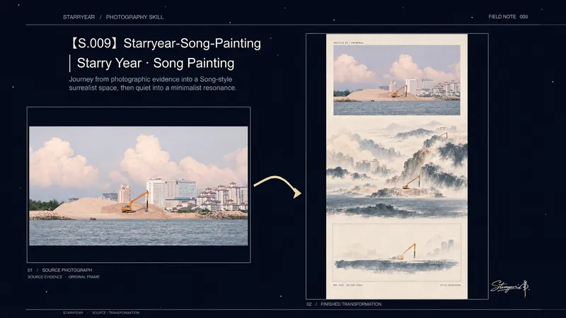
Image【S.009】Song Art · Starryear
Turn a single photo into a vertical editorial art poster, guiding the same visual structure through three progressively quieter modes of looking: “evidence, reconstruction, and afterglow.” The untouched original photo remains at the top as visual evidence. In the middle, space is reorganized through the Northern Song landscape concepts of high distance, deep distance, and level distance, transforming the subject, direction, repeated forms, and negative space into a textured, expressive surreal scene. At the bottom, the image is distilled into a restrained structural afterimage, brought to a close with warm paper, a fine frame, and a few pale color echoes. The complete work preserves the photo’s key compositional relationships while gradually reducing scale, layering, density, and narrative, creating a continuous viewing experience from concrete imagery to expressive interpretation and then minimalism. It is suited to contemplative triptychs, photo translations in the context of Song painting, exhibition posters combining photography and contemporary art, and vertical publications centered on negative space and visual storytelling. The result is one complete, unified tall poster—not an ordinary filter, a photo redraw, or three side-by-side files.
Information
- Version
- v4
- Last updated
- Runtime credits
- Usage-based
- Models
- Auto
