
Webpage Quality Review
Four-dimensional webpage quality review
Webpage Quality Review
Four-dimensional webpage quality review
Showcase
Description
This skill provides professional webpage evaluation and optimization services. Whether you are a website designer, developer, or content creator, you can use it to conduct an in-depth analysis of your own or someone else’s webpage and receive actionable improvement suggestions. The skill comprehensively evaluates a webpage’s design quality, originality, craftsmanship, and functionality. It provides detailed scores across multiple dimensions, including color combinations, typography and layout, visual themes, interactive effects, and responsive design, while also identifying potential signs of AI-generated content or template-based design. After the evaluation, you will receive a detailed report covering specific strengths, issues, improvement suggestions, and even possible directions for modifying CSS, HTML, and JavaScript code. After the evaluation report is generated, you can also choose to have AI optimize the webpage immediately based on its recommendations. The optimization process follows the priority order of design quality, originality, craftsmanship, and functionality. You will then receive an optimization completion report clearly showing score comparisons across each dimension before and after optimization, along with the key improvements made.
Recommended by
淡苍
Why we love this skill
Systematically reviews webpages across four dimensions and provides actionable priorities and before-and-after comparisons, with particular strength in identifying templated design, AI-generated traces, and responsive or usability issues.
Related Skills
View all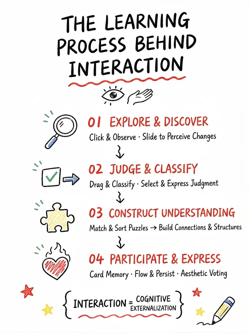
Arts Education Visual Webpages
Easily transform K-12 arts education content into lively and engaging interactive web experiences. This skill is designed specifically for arts teachers, helping you present diverse arts courses—including fine arts, music, dance, drama, film, calligraphy, and intangible cultural heritage—to students through visualization and gamification. Whether you want to design click-to-explore, drag-and-drop sorting, color experiments, aesthetic voting, or challenge tasks, this skill can intelligently generate a variety of interactive plans based on your course name, core knowledge points, and teaching objectives. It not only transforms abstract arts concepts into digital content that students can view, manipulate, and create, but also iterates and optimizes based on your feedback, ensuring the plan meets teaching needs while being aesthetically pleasing. In the end, you will receive a detailed interactive webpage content draft, including page structure, student workflow, feedback design, visual style suggestions, and classroom usage guidance. Additionally, this skill can directly generate AI-ready webpage creation prompts, HTML design drafts, and even single-file HTML code, instantly energizing your arts classroom and enhancing student engagement and learning outcomes.
Overseas Tool Demand Analysis
Are you looking for low-competition, high-potential overseas tool website startup opportunities? This skill is designed for independent developers, SEO webmasters, and AI tool entrepreneurs, helping you accurately identify truly valuable directions from vast market information. It deeply analyzes your market ideas, keywords, or competitors, revealing target user pain points, use cases, and potential business value. Through detailed search intent analysis, this skill expands tool-type keywords such as 'generator,' 'converter,' 'checker,' etc., and evaluates whether there are clear user needs, community complaints, and monetization potential. It helps you distinguish which are suitable as SEO traffic entry points, which can effectively acquire potential customers, and which have the potential to develop into sustainable paid products or SaaS, avoiding blind investment. Notably, this skill pays special attention to the reuse potential of tools and prioritizes opportunities suitable for small teams, simple implementation, and not relying on complex operations. Ultimately, you will receive a clearly ranked list of candidate directions, including detailed user personas, pain points, keyword strategies, competitive analysis, monetization signals, and minimum viable product (MVP) recommendations, helping you reduce decision risk and increase startup success rates.
 Image
ImageSENSUS Daily Aesthetic Lesson
This skill is designed to combine user-provided images with an aesthetic principle, deeply analyze their visual composition, and transform that analysis into prompt templates and practice cases usable by AI image generation tools. It is suitable for designers, artists, content creators, and any user who wants to improve their visual literacy and master AI image generation techniques. With this skill, users can submit images and specify an aesthetic theme, or let the AI deduce one from the image content. The skill will perform a detailed analysis of the image from multiple dimensions such as composition, color, mood, and technique, centered around the chosen theme. Then, based on the analysis, it generates a set of AI prompt templates that include English and Chinese explanations and variable descriptions, helping users understand how to translate abstract aesthetic principles into concrete AI instructions. Additionally, the skill uses AI image generation to create new practice case images based on those templates, and provides a detailed review that highlights the accuracy and deviations of the AI execution, along with specific adjustment suggestions. Finally, all analysis and generated content is presented in a well-structured, professional "Aesthetic Deep Dive" document, helping users deepen their understanding of visual aesthetics and master practical methods for applying aesthetic concepts to AI creation.
Information
- Version
- v7
- Last updated
- Runtime credits
- Usage-based
- Models
- Auto
