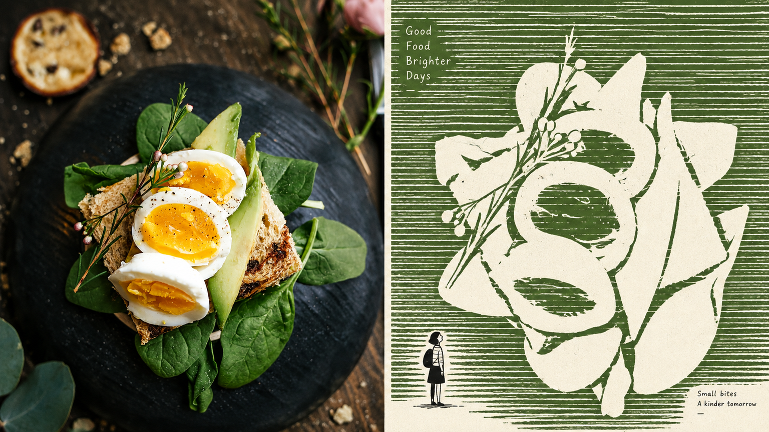
GPT2 x Negative Monument
By xiaoxiaodong P230
GPT2 x Negative Monument
By xiaoxiaodong P230
Showcase
Description
For turning everyday photos into minimalist independent-publication illustrations: exhibition studies, personal photography projects, and literary visuals. The upper half retains a recognizable version of the original photo; the lower half does not depict the subject, but instead builds a field of dense, slightly shaky, broken horizontal strokes, leaving the subject as a huge, quiet expanse of negative space. A tiny, naïve figure contrasts with, passes through, or accompanies this monument. Use no more than three colors: a warm white paper ground, one soft, bright ink color drawn from the source image, and black. The image must use flat graphic forms while retaining paper texture and slight misregistration. Avoid volumetric rendering, gradients, shadows, smooth digital rendering, and flashy multicolor treatments.
Recommended by
淡苍
Why we love this skill
Transforms user photos into distinctive negative-space monuments with irregular horizontal-line textures, vast quiet areas of white space, and a playful tiny figure. Limited colors, flat print texture, and simulated grain create a restrained, unique poster language.
Related Skills
View all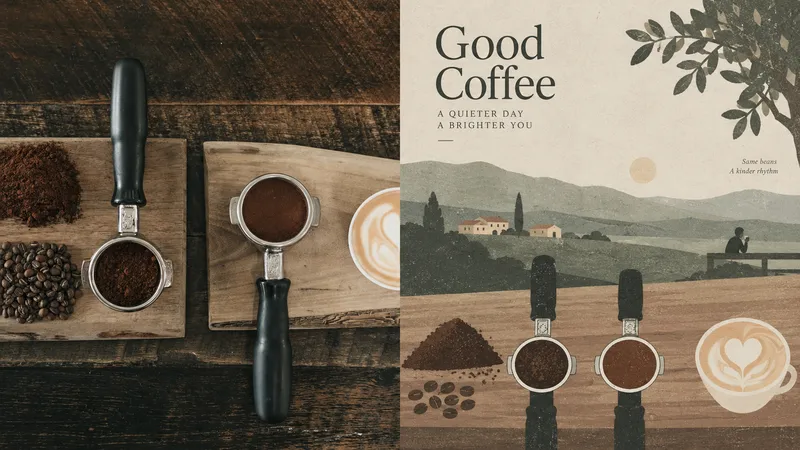 Image
ImageGPT2 x Horizontal Folk Art
Ideal for turning photos into quiet, detached, place-aware editorial illustrations with a modern folk-art sensibility—for independent publishing, exhibition studies, and local visual work. The upper half preserves the recognizable source image; the lower half compresses the scene into shallow horizontal bands of color—fields, roads, walls, rooftops, and trees—with extremely low density and generous negative space. If people appear, they are tiny, isolated points. Matte paper, subtle screen-print grain, and the texture of vintage book illustrations. A highly desaturated palette—gray-green, sage, warm beige, light gray, faded burgundy, and earth brown—compressed from the original image. Overcast, diffused light. Avoid high saturation, fluorescents, heavy rendering, a slick digital feel, and commercial titles.
 Image
ImageGPT2 x Pause Notes
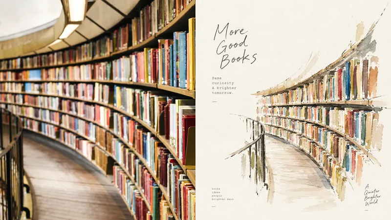
Ideal for turning everyday photos into a one-page personal notebook illustration: a journal spread, independent publication, or small exhibition piece. The upper half keeps the original photo recognizable; the lower half retains only the silhouette, personality, and expression, drawing the subject small with relaxed, broken ink lines and a touch of thin watercolor. Leave plenty of white space rather than filling the page, allowing pauses in the drawing and edges that remain open. Take two to four colors from the original image—light, thin, and restrained, but precise. Keep the text small and understated, placed in the corners of the open space. Avoid filling the page, smooth digital polish, a plastic look, fluorescent colors, and commercial-style titles.
 Image
ImageGPT2 x New Folk Art
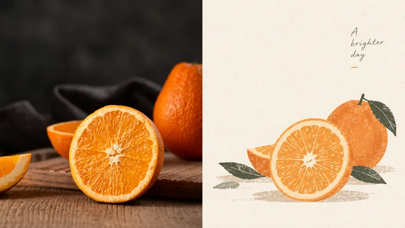
Ideal for turning everyday photos into quiet, nostalgic illustrated vignettes with a contemporary folk-art sensibility—for organizing personal photography, independent publishing, exhibition studies, and lifestyle brands. The upper half preserves the original image's recognizability; the lower half does not simply apply a filter, but retains only the most identifiable shapes and relationships, reworking a beautiful moment with rounded, simplified forms, powdery gouache, and an abundance of negative space. The overall result is quiet, intimate, poetic, restrained, warm, and nostalgic: small-scale subjects, generous negative space, powder blue and ivory, botanical green, and small touches of coral red. Avoid densely filled realism, high saturation, fluorescent colors, a slick digital look, plasticity, and piles of commercial-style headlines.
Information
- Version
- v6
- Last updated
- Runtime credits
- Usage-based
- Models
- Auto
