Pen × Neg. P092 | xiaoxiaodong
By xiaoxiaodong
Pen × Neg. P092 | xiaoxiaodong
By xiaoxiaodong
Showcase
Description
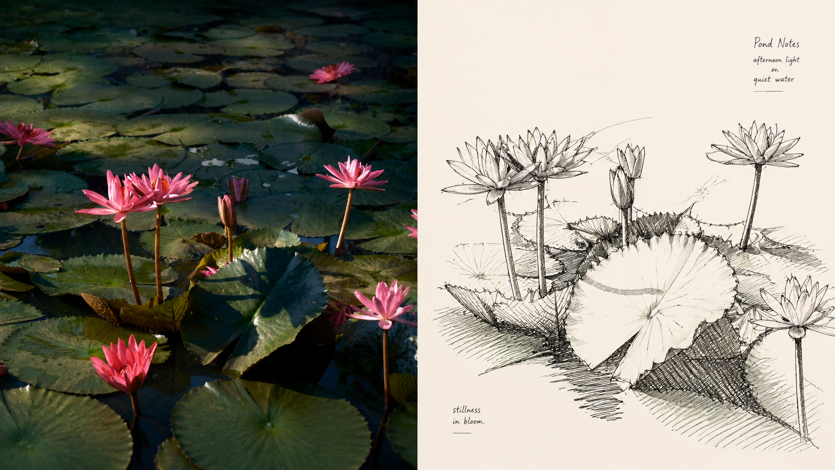
Panel 092 uses loose yet precise contour line drawing to preserve the identity of the subject, while diagonal hatching, cross-hatching, and scribble hatching shape dark areas and structural transitions. Freeform curves handle people, animals, plants, and objects; grouped diagonal lines and linear geometry establish the order of tabletops, walls, floors, furniture, and shadows, balancing a relaxed feel against a stable framework. Works well when you Want bold black-and-white graphic impact: Let dense hatched dark masses and generous negative space establish visual hierarchy. Need gestural speed and an observational feel: Preserve quick, free, slightly rough lines, repeated corrections, and uneven density. Seek tension between looseness and order: Let freeform contours carry organic subjects, while geometric hatching provides the environmental framework and layout stability. Need flexible delivery: Supports vertical, horizontal, pure-design, multi-aspect-ratio, and four-way wallpapers, and can also process image directories in batches.
Recommended by
Shuting@YouMind
Why we love this skill
Transforms real-world imagery into complete pen-texture and negative-space compositions while supporting multiple layouts and wallpaper outputs for different devices.
Related Skills
View all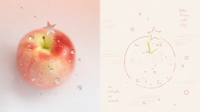 Image
Imagexiaoxiaodong x Line P081
Panel 081 uses a near-uniform-width monoline system to compress subjects, contours, poses, and relationships into a small set of memorable symbols. Open contours, broken edges, subtle jitter, and misalignment remove the mechanical vector feel; 2–4 colored lines extracted from the original image encode information directly, establishing foreground and background through line density, brightness, and spot-color hierarchy. Grain, registration shifts, and uneven inking create the authentic warmth of a commemorative print. Good for these situations Want to turn photos into a personal keepsake album: Use a few colored monolines to preserve the details in people, places, objects, and relationships that are truly worth remembering. Dislike the cartoon look of black outlines: Let 2–4 spot-color lines derived from the original image handle contours, structure, and information hierarchy directly. Need negative space and editorial order: Use open contours, layered line density, and asymmetric layouts to bring air, distance, and emotion into the image. Need flexible delivery: Supports top-and-bottom, side-by-side, design-only, multi-ratio, and four-edge wallpapers, and can also process image directories in batches.
 Image
ImageXiaoxiaodong x Crayon x Sketch x P075
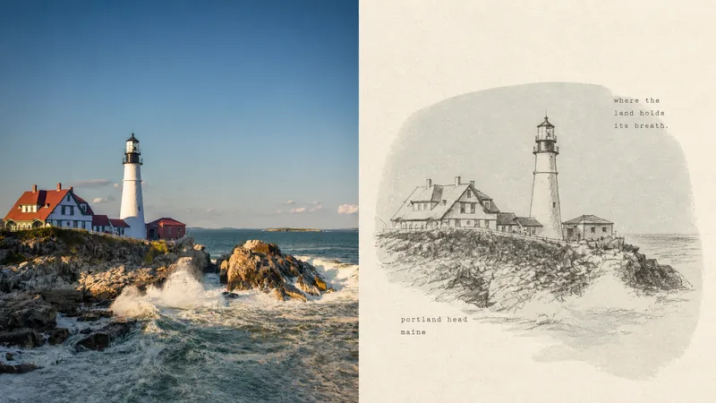
Panel 075 preserves the subject’s most essential proportions, direction, structure, and pose, then redraws them with loose, dark crayon lines that retain subtle signs of correction. A low-saturation, irregular color field drawn from the original image’s overall tones provides quiet support, while cream handmade paper and generous negative space carry the mood, distance, and passage of time. A few tiny typewritten words feel like private notes without interrupting the image’s breathing room. Best suited for Tired of formulaic vintage filters: The paper, grain, and imperfect lines all take part in the storytelling rather than applying a uniform effect over the photo. Need to draw less while staying accurate: Details can remain unfinished, but the subject’s key proportions, direction, structure, and pose must remain recognizable. Drawn to a quiet independent-publishing aesthetic: A soft monochrome color field, Risograph grain, generous negative space, and small typewritten text create a restrained layout. Need flexible delivery: Supports portrait, landscape, design-only, multiple aspect ratios, and four-sided wallpapers, and can also process image directories in batches.
 Image
Imagexiaoxiaodong x Sketch Wash P079
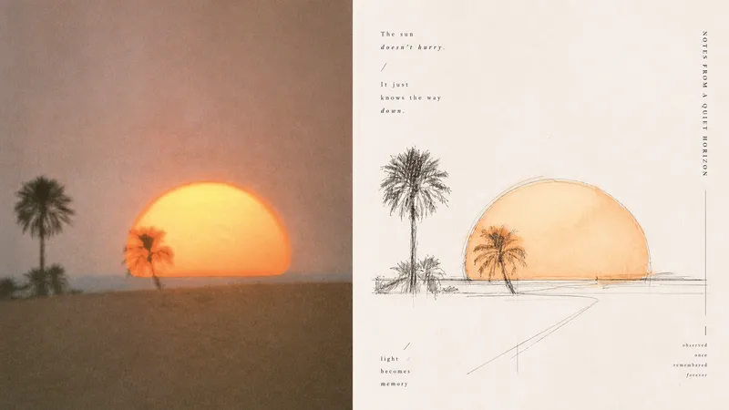
Ordinary photo outline filters mechanically copy edges; full watercolor treatments tend to fill the background, making the subject, space, and editorial rhythm feel heavy. Panel 079 keeps only the structures, spaces, gestures, and relationships in the scene most worth remembering: long straight perspective lines, angular lines, and geometric axes build a rational framework; free organic curves, searching lines, and broken lines retain a tactile feel; a small amount of transparent watercolor extracts recognizable colors from the original. Broad areas of natural paper white create air and pauses. Text follows structural lines and whitespace to join the composition, resulting in something like an art-directed architectural travel sketchbook or an independent visual publication. Best suited for these situations - **Architecture, travel, and on-site observation:** Use the strongest straight lines, turns, facets, and proportional relationships to build the space. - **You want to preserve the vitality of an “in-progress drawing”:** Embrace exploratory repeated lines, broken lines, slight misalignment, and unfinished edges. - **You want color drawn from the photo without overfilling the image:** Use a small amount of transparent wash only where needed, layering ink lines, color, and paper white. - **You need flexible delivery:** Supports portrait, landscape, design-only, multiple aspect ratios, and four-edge wallpaper formats, and can batch-process image directories.
Information
- Version
- v3
- Last updated
- Runtime credits
- Usage-based
- Models
- Auto
