Enterprise Strategy Lens
High-density corporate strategy diagrams
Enterprise Strategy Lens
High-density corporate strategy diagrams
Showcase
Description
As an expert in strategic analysis for executives, I know exactly this pain point: you have some messy industry data, but you need to 'create a visual analysis for tomorrow's presentation.' You spend three days organizing, checking data seven or eight times, tweaking the charts through eighteen versions, only to end up with results that look like Excel screenshots—too ugly to even look at—or garish colors with no clear focus. This tool is designed to solve that problem. Make data speak, make insights instantly visible. [Function] Turn scattered financial data, industry reports, and operational metrics into professional visual charts and strategic insight highlights in seconds. [Effect] Input data → Automatically generate long images/charts ready for pasting into PPTs, plus 5 core insights. [Who uses] Investment banking/consulting advisors: quick industry scans for clients. Corporate strategy departments: deliver reports for bosses in 10 minutes. Media/influencers: professional visuals for business analysis articles.
Recommended by
Nico@YouMind
Why we love this skill
This skill transforms enterprise strategic data into beautifully designed graphics with ultra-high information density. It uniquely combines data collection, insight extraction, and professional visualization, making it a powerful assistant for business analysts.
Related Skills
View all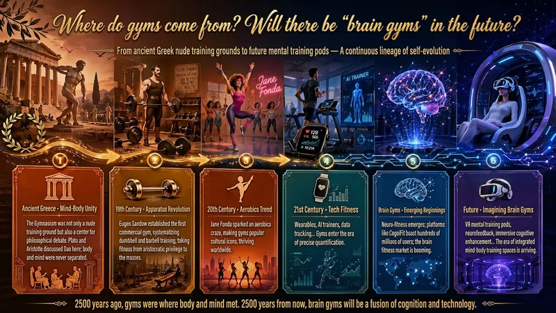
Idea to Infographic
A single image, a single sentence is all it takes. Have you ever had this experience—you have a great idea and want to turn it into an infographic like the ones big accounts post, but: - Open an AI image tool, rewrite prompts over and over, and the result either has terrible layout or completely mismatched style. - Tried several prompt templates, each requiring three or four adjustments, and half an hour later you're still not done. - Want styles like financial literacy, Chinese classic, science, tech... each time you have to research colors and layouts from scratch. Now you don't have to. 「Idea to Infographic」automates all of this: You say "make an emotion management infographic," and it decides whether to use a warm Chinese style or a healing scientific style, searches and organizes core knowledge points, breaks them into 6-8 module cards, assembles the optimal prompt, and quality-checks—if it fails, it automatically redoes; if it passes, it hands it right to you. Four killer capabilities, all built-in: 🧠 **Style Engine** — Not a rigid four-choice. If your topic matches financial literacy, it automatically goes with deep blue gold; if it matches Chinese classics, it uses rice paper and ink; if it matches technology, it uses cyan neon. For topics outside these four? It automatically synthesizes a new style. Coffee encyclopedia → food warm tones; exercise and fitness → vibrant orange gray. No style it can't handle. 🔍 **Content Brain** — You give a word, it searches the web to fill out content; you give a paragraph, it extracts the core; you give nothing but a topic, it organizes everything clearly. All three input methods are supported—the simpler, the more effortless. 📐 **Layout Adviser** — Progressive ladders, side-by-side comparisons, causal chains, overarching-subcategory radiation... Five logical patterns automatically matched. Not just stuffing text into an image, but actually designing an infographic. ✅ **Self-Inspection** — After generating, it automatically checks layout, text density, image-to-text ratio, and style match. If there's an issue, it adjusts and regenerates, up to two times. You don't need to know how to write prompts; you just need to know how to speak. **Who is this Skill for?** - Social media creators who need to produce images daily but don't want to learn design. - Knowledge commerce creators who want to visualize course content but lack a designer. - Corporate trainers who need professional infographics but lack budget for outsourcing. 🔍 - Anyone who wants to turn an idea into a great image. In a word: You have the idea, it has the image. All the hassle in between, it handles for you.
Stock Report Analyzer
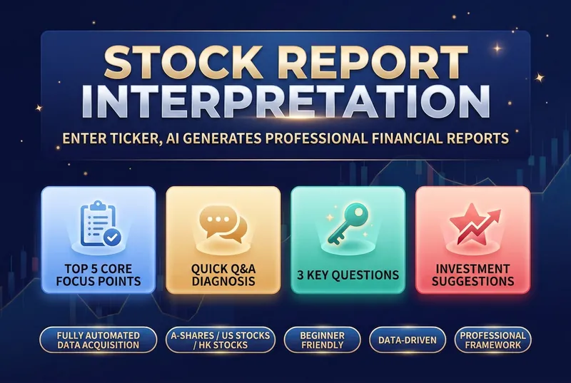
Financial reports are a listed company's "physical exam report", but most investors feel lost when faced with pages of dense numbers: • 📝 Can't read the three financial statements — What do the balance sheet, income statement, and cash flow statement tell you? Which numbers matter most? • 🤔 Don't know what to look at — With dozens of pages, which key metrics should you focus on? • 📊 Lack an analysis framework — Even when you find the data, how do you judge good from bad and cross-check it? • 🏭 Industry standards differ — What counts as "good" varies completely by industry; manufacturing and internet companies can't be measured with the same yardstick. • ⏰ Time cost is too high — Manually looking up data, comparing peers, and calculating growth rates can take hours for one report. This skill was built to solve exactly these problems. It automates a professional financial analyst's framework, so you just need to enter a stock code to get a structured, logical, and beginner-friendly financial report interpretation. The tool's core value lies in its rigorous analysis framework, covering multiple dimensions from assessing growth quality to analyzing business models. It not only compares core metrics like revenue, gross margin, net margin, and cash flow, but also runs a quick Q&A on the seven key financial questions investors care about most. It clearly shows whether profits are turning into real cash, and whether receivables and inventory carry potential risks. By benchmarking against industry leaders, it helps you identify a company's true position in its industry chain. When generating the report, it also evaluates valuation levels, core strengths, and potential risks, and offers data-driven recommendations on what to watch. All analysis is presented in intuitive tables and plain, easy-to-understand language, turning complex accounting terms into concrete investment logic. Whether for daily review or deep research, it helps you quickly zero in on the core issue amid massive amounts of data, improving the efficiency and accuracy of your investment decisions.
 Slides
Consulting-Style Slides
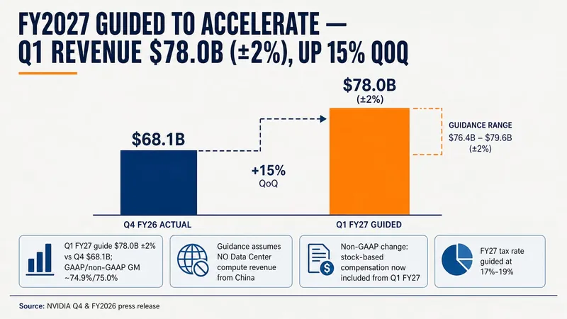
This Skill helps you create high-quality business Slides to the professional standards of top-tier consulting firms. It strictly follows the Pyramid Principle and applies the core ideas of leading with conclusions, progressing logically, and using data to turn scattered business insights into structured, coherent presentations. Whether you are developing a strategy, proposing a project, or conducting a business analysis, it helps you quickly build a framework based on the MECE principle, ensuring that points are mutually exclusive and collectively exhaustive. During content development, this Skill automatically distills insightful slide titles and recommends the most suitable visualizations based on your data, such as waterfall charts, funnel charts, and stacked bar charts. It provides structured design guidance and can also generate a professional Slides file with title slides, content slides, comparison slides, and chart placeholders. The generated document uses a classic dark blue and orange business color palette, with clean, professional layouts and clear visual hierarchy, helping your presentation demonstrate a high level of professionalism in both design and content.
Information
- Version
- v2
- Last updated
- Runtime credits
- Usage-based
- Models
- Auto
