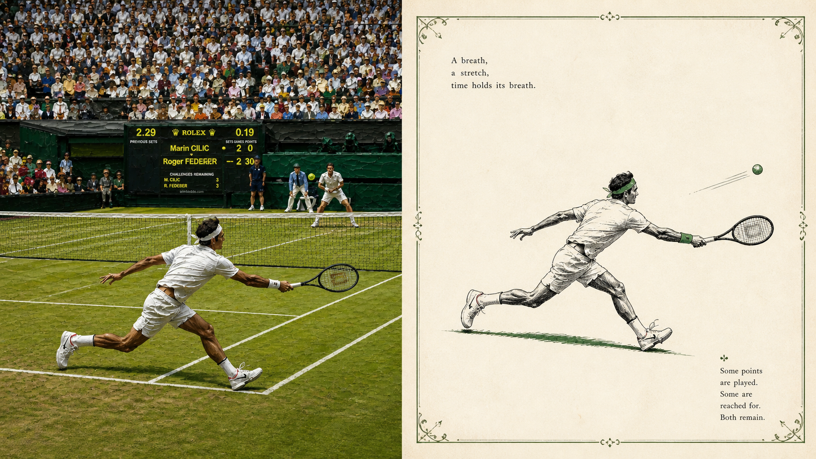
xiaoxiaodong × Classic × Title Page × P094
By xiaoxiaodong
xiaoxiaodong × Classic × Title Page × P094
By xiaoxiaodong
Showcase
Description
Panel 094 uses fine ink lines, selective solid black, and sparse hatching to distill a single spot color from the photo. With generous negative space, an optional hand-drawn decorative border, and classical publishing type, it reconstructs a quiet scene reminiscent of an early-20th-century children’s book or poetry collection title page. Good for Want to preserve the subject while removing noise: Keep only the clues needed for identity, posture, emotion, and narrative relationships. Like classic two-color publications: Black ink paired with one spot color drawn from the original image, ivory paper, and slight misregistration. Need truly meaningful negative space: The subject can be reduced, isolated, or suspended, allowing the blank space to become part of the poetry. Need flexible delivery: Supports vertical, horizontal, design-only, multiple aspect ratios, and four-edge wallpapers, as well as batch processing of image directories.
Recommended by
Shuting@YouMind
Why we love this skill
Featured for its faithful translation of the original design brief, flexible output formats, multi-device wallpapers, and one-by-one final checks.
Related Skills
View all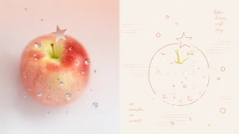 Image
Imagexiaoxiaodong x Line P081
Panel 081 uses a near-uniform-width monoline system to compress subjects, contours, poses, and relationships into a small set of memorable symbols. Open contours, broken edges, subtle jitter, and misalignment remove the mechanical vector feel; 2–4 colored lines extracted from the original image encode information directly, establishing foreground and background through line density, brightness, and spot-color hierarchy. Grain, registration shifts, and uneven inking create the authentic warmth of a commemorative print. Good for these situations Want to turn photos into a personal keepsake album: Use a few colored monolines to preserve the details in people, places, objects, and relationships that are truly worth remembering. Dislike the cartoon look of black outlines: Let 2–4 spot-color lines derived from the original image handle contours, structure, and information hierarchy directly. Need negative space and editorial order: Use open contours, layered line density, and asymmetric layouts to bring air, distance, and emotion into the image. Need flexible delivery: Supports top-and-bottom, side-by-side, design-only, multi-ratio, and four-edge wallpapers, and can also process image directories in batches.
 Image
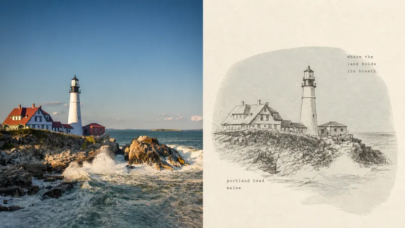
ImageXiaoxiaodong x Crayon x Sketch x P075
Panel 075 preserves the subject’s most essential proportions, direction, structure, and pose, then redraws them with loose, dark crayon lines that retain subtle signs of correction. A low-saturation, irregular color field drawn from the original image’s overall tones provides quiet support, while cream handmade paper and generous negative space carry the mood, distance, and passage of time. A few tiny typewritten words feel like private notes without interrupting the image’s breathing room. Best suited for Tired of formulaic vintage filters: The paper, grain, and imperfect lines all take part in the storytelling rather than applying a uniform effect over the photo. Need to draw less while staying accurate: Details can remain unfinished, but the subject’s key proportions, direction, structure, and pose must remain recognizable. Drawn to a quiet independent-publishing aesthetic: A soft monochrome color field, Risograph grain, generous negative space, and small typewritten text create a restrained layout. Need flexible delivery: Supports portrait, landscape, design-only, multiple aspect ratios, and four-sided wallpapers, and can also process image directories in batches.
 Image
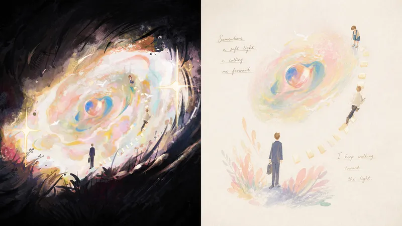
ImageXiaoxiaodong x Pastel P071
Panel 071 distills the subject, pose, and narrative relationships into a small number of soft, slightly naive forms and color blocks. Pastels, wax crayons, water-soluble colored pencils, and light gouache leave behind traces of rubbing, paper show-through, layered color, and pauses. Elements float, echo, or draw one another across a near-white paper surface like fragments of memory. Fine handwritten lines of poetry, with shifting pressure and drifting baselines, move naturally through the negative space instead of being placed into a title template. Good for these situations Want to preserve a memory rather than recreate a scene: The subject’s identity and key relationships remain recognizable at a glance, while complex backgrounds intentionally recede. Like softness without childishness: Powdery texture, rubbing, and translucent layers add tactility, while mature compositions avoid a children’s-cartoon feel. Need text to truly enter the image: Words grow from movement, sound, emotion, or metaphor, creating a reading rhythm through relaxed handwriting. Need flexible delivery: Supports vertical, horizontal, design-only, multiple aspect ratios, and wallpapers for all four edges, as well as batch processing for image directories.
Information
- Version
- v3
- Last updated
- Runtime credits
- Usage-based
- Models
- Auto
